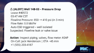
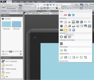
As someone who has spent over 20 years immersed in control systems engineering and SCADA technologies, I’ve seen firsthand how crucial human-machine interfaces (HMIs) are in maintaining efficient, safe, and optimized industrial operations. One of the major advancements in this area is high-performance HMI (sometimes referred to as HPHMI).
In this blog, I’ll guide you through what high-performance HMI is, why it matters, and the fundamental principles of HMI design, touching on how it integrates with industrial automation and various process control systems.
The Basics: Learn about HMIs
Contents
ToggleWhat is High-Performance HMI?
High-performance HMI is a design philosophy focused on creating interfaces that present critical information clearly, enabling operators to make faster and better decisions. Traditional HMIs often overwhelm users with too much detail, relying on complex visuals or excessive color schemes that can obscure key data points. In contrast, HPHMI uses simplified, data-driven graphics and emphasizes situational awareness by focusing on actionable information, making it crucial for optimizing distributed control systems (DCS), process automation, and manufacturing automation environments.
Traditional vs. High Performance HMI at a Glance


The table below summarizes the main differences between traditional and high-performance HMI.
| Feature | Traditional HMI | High-Performance HMI |
| Graphics | 3D renderings, colorful displays | Flat, simple icons |
| Color Usage | Multiple colors, often decorative | Limited color, only for alarms |
| Data Presentation | Complex details | Prioritized key information |
| Cognitive Load on Operators | High | Low |
You can see how these principals work in practice in the images above.
Why is High-Performance HMI Important?
When designed correctly, high-performance HMI improves operator efficiency, reduces errors, and enhances safety across process control systems and industrial automation setups. Here are a few reasons why:
- Faster Decision Making: Simplified visual elements help operators in control system environments quickly interpret data.
- Improved Situational Awareness: Clear, concise displays improve real-time monitoring of SCADA systems and PID controls.
- Reduced Cognitive Load: High-performance HMI minimizes the mental effort required to monitor and control distributed control systems (DCS) and process control systems, helping operators focus on critical tasks.
A well-designed HMI can make all the difference in catching a problem early and avoiding costly downtime or safety incidents. Implementing SCADA HMI Systems built on these principles ensures that operators in control systems engineering environments have the best tools at their disposal.
Principles of High Performance HMI Design
Designing an effective high-performance HMI requires a deep understanding of the industrial automation environment and the specific needs of operators in process automation and process control systems.
Below, we outline 6 core principles to consider when designing HMI systems.
1. Simplicity and Clarity
One of the foundational principles of high-performance HMI is simplicity. Overly detailed displays can distract operators from important information. Focus on presenting data that is directly relevant to operations in SCADA and distributed control systems (DCS) environments. Use minimalist graphics to reduce visual noise, ensuring quick operator response in RTU and PID controls.
For example, instead of using detailed 3D renderings of machinery, use simple, flat icons to represent key components. This approach is key in SCADA Design, where clarity and functionality are prioritized over aesthetics.
| Do’s | Don’ts |
| Use minimalist graphics to reduce visual noise, making essential information stand out. | Don’t use complex or detailed 3D graphics, as they can distract operators and slow down response times. |
| Present only data that is directly relevant to operations. | Don’t clutter the screen with unrelated or low-priority information. |
| Use flat icons to represent components instead of detailed renderings. | Don’t prioritize aesthetics over functionality, especially in SCADA Design environments. |
| Organize information in logical, easy-to-follow layouts. | Don’t create crowded displays that force operators to search for critical data. |
2. Color for Purpose, Not Decoration
In high-performance HMI, color is used sparingly to highlight important information such as alarms or critical values in process automation systems. A muted grayscale background ensures that colors stand out, making it easier for operators to quickly identify when something requires attention.
For instance, a red indicator should be reserved for emergencies, and not used for cosmetic purposes. Effective color use is critical when designing interfaces for SCADA and control systems engineering, where attention to alarms must be instantaneous.
| Do’s | Don’ts |
| Use color sparingly to highlight important elements, such as alarms or critical values. | Don’t use bright or varied colors for decorative purposes. |
| Implement a grayscale background to ensure highlighted colors stand out. | Don’t use colors like red or yellow for non-critical elements, as they may confuse operators. |
| Use a consistent color scheme across all displays to avoid confusion. | Don’t change color meanings across screens, which could lead to misinterpretation. |
| Reserve red specifically for emergencies to signal immediate attention. | Don’t use colors inconsistently, as this can desensitize operators to critical alerts. |

3. Prioritize Key Information
When designing an HMI, the key is to prioritize the most relevant data and present it prominently. Operators need to access critical KPIs, trends, and real-time statuses without having to sift through unnecessary details, whether they’re managing SCADA systems or process control systems. This allows for better focus on operations and improved decision-making in industrial automation processes.
Data-driven displays, like those seen in SCADA Data Collection, show how raw data is transformed into actionable insights, giving operators the information they need at a glance.
| Do’s | Don’ts |
| Display the most critical KPIs and data prominently on the main screen. | Don’t require operators to dig through multiple screens for essential information. |
| Use dashboards or displays that aggregate key data into a clear, accessible format. | Don’t overload the interface with less relevant metrics that may distract from primary tasks. |
| Organize information hierarchically, starting with high-level insights and allowing for deeper exploration. | Don’t give all data equal prominence, as this can cause operators to overlook important details. |
| Regularly review and update which data is prioritized based on evolving operational needs. | Don’t assume that static displays of key information will always be effective for dynamic operations. |
4. Contextual Navigation and Layering
Organize content with a hierarchical structure, starting with an overview screen showing high-level metrics, then drilling down for detailed information.
Contextual navigation organizes information within the HMI in a way that reflects the operator’s natural workflow, ensuring they access relevant information quickly. A well-structured HMI begins with an overview screen showing high-level metrics, allowing operators to assess the system’s status at a glance. From there, intuitive drill-down options lead to specific details, such as component status, historical data, or trend analysis, as needed.
This hierarchical structure ensures that operators start with a broad understanding before diving into specifics, streamlining the information flow. Clear, consistent icons and logical screen transitions allow operators to navigate the system without confusion, ensuring critical information is accessible within just a few clicks. By reducing the time spent searching for data, contextual navigation supports faster decision-making and minimizes cognitive load, ultimately enhancing both operator efficiency and overall system safety.
| Do’s | Don’ts |
| Begin with an overview screen, then provide intuitive drill-downs for detailed data. | Don’t overwhelm operators with detailed data on the main screen. |
| Ensure screen transitions and navigation paths are logical and reflect the workflow. | Don’t create confusing navigation paths that make it difficult to access essential data. |
| Use consistent icons and labels to help operators quickly understand navigation options. | Don’t change icon meanings or layouts frequently, as this can slow down decision-making. |
| Regularly assess navigation efficiency with operator feedback to optimize usability. | Don’t ignore user experience in navigation, as poor design can increase cognitive load and errors. |
5. Use Trends and Graphs to Visualize Key Trends
Graphical elements like trends and real-time data visualizations are incredibly useful in high-performance HMI systems. These tools help operators spot patterns or irregularities quickly in process automation and PID controls. Instead of static numbers, dynamic charts provide deeper insights, enabling better control in SCADA and RTU environments.
Incorporating SCADA Real-Time Monitoring into your HMI design can help operators see not just the present state but also predict future performance based on historical data.
| Do’s | Don’ts |
| Use trend graphs to show changes in key variables (like pressure or temperature) over time. | Don’t rely solely on static data for critical metrics where trends are essential. |
| Employ dynamic charts for real-time data insights, enabling quick response to irregularities. | Don’t use overly complex or cluttered graphs that make it hard to see important patterns. |
| Focus on displaying the most relevant metrics, allowing operators to spot patterns or anomalies easily. | Don’t overwhelm operators with too many graphs at once; prioritize the most critical data. |
| Use line graphs or bar charts for clear visual tracking of variable trends in SCADA systems. | Don’t use charts that lack labels or clear axis definitions, which can cause misinterpretation. |
6. Effective Alarm Management
Effective alarm management is crucial for maintaining a safe, efficient operation. Alarms should be specific, descriptive, and prioritized based on urgency. Overloading operators with alarms, especially minor or irrelevant ones, can lead to “alarm fatigue,” where they may start ignoring alerts or miss critical ones. A well-designed HMI prioritizes alarms by urgency, highlighting safety-critical issues while filtering out low-priority notifications. Alarms should be categorized, with clear visual distinctions between levels, such as color-coding for critical, warning, and informational alerts. Each alarm message should be concise and specific, ideally with actionable instructions—”Check Pressure Valve” is far more helpful than a vague “System Fault.” Operators can then focus on responding to high-impact issues first, ensuring they are not distracted by minor notifications. Regularly reviewing and tuning alarm thresholds and messages based on operator feedback can further refine the system, leading to safer, more efficient monitoring and improved response times.
| Do’s | Don’ts |
| Prioritize alarms by urgency and importance to prevent overload and alarm fatigue. | Don’t overload operators with too many minor or irrelevant alarms. |
| Use specific, actionable messages (e.g., “Check Pressure Valve”) for each alarm. | Avoid vague messages like “System Fault,” which can leave operators uncertain about the issue. |
| Categorize alarms by criticality, using clear visual cues to differentiate levels. | Don’t mix critical and non-critical alarms without clear distinctions, as it could lead to missed alerts. |
| Regularly review alarm settings and adjust thresholds based on operator feedback. | Don’t set alarm thresholds too low, which can desensitize operators to actual high-priority alerts. |
Takeaways
By following the principles outlined above, an HMI can help operators make informed decisions more quickly and effectively, leading to better overall system performance and safety.


